WHY I CHOSE TO DESIGN MY OWN BOOKS
I started designing and editing my own books for practical reasons.
At first, I thought writing a book would be a lark, that I’d write one children’s book and be done with it. I didn’t want to dump a whole bunch of money into hiring an editor and typesetter because I didn’t see how I could possibly make a return on the investment.
Six years later, I have written ten books for children. And, in the process, became a self-made expert in children’s book design and self-publishing.
Little did I know that designing my books would be a true pleasure! Yes, in the beginning, I didn’t want to invest a lot in the completion of a book, but then I found the design process offers one aspect of the creative process where I have complete control.
The choices and possibilities for children’s book design are only limited by the designer’s imagination. Of course, there are publishing guidelines (examples include gutters and margins), but the designer can pretty much position text, use color, and change fonts and size, as the artist in the designer sees fit.
A FORMULA FOR WRITING, ILLUSTRATING, AND DESIGNING A CHILDREN’S BOOK
To write, illustrate, and design my books, I have developed a three-step process:
1. I use Microsoft Word to write the story.
2. I draw pictures using the Microsoft Paint 3D Program.
3. I combine the words and pictures in a PowerPoint presentation. This is where I edit/design the layout of the book. (Hint: If you do not know how to use PowerPoint, there are plenty of tutorials on YouTube.)
THE COVER DESIGN
Normally, books are laid out with even pages on the left and odd pages on the right. The cover is an odd page. It is the first page that gets designed. Go to the children’s section in the library. Every cover of every book is different! The words are written in a whacky text. The text is all over the place! And there’s tons of color! The text is colorful and bold: the words jump out at the reader.
The book cover introduces the book to the reader for the first time.
So the cover should reflect what the book is about, in a way, telling the story in one page.
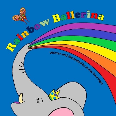
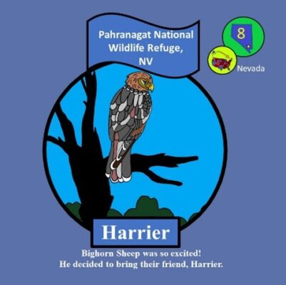
For example, Rainbow Ballerina was a fun cover to design. I love motion, so I envisioned the motion of a rainbow being sprayed from an elephant’s trunk. I mimicked that shape in the text of the title and my name. I found I had too much white space (in this case blue space), so I added a character from the book that added a splash of color at the upper left-hand corner. I think this accurately portrays what the children will read about in the book about an elephant that blows rainbows from her trunk. This is the cover of Rainbow Ballerina (2019):
THE INTERIOR DESIGN
When designing the interior of a children’s book, I get to decide the font, the size of the text, and the position of the text. The important thing is consistency. I decide on the font and use it all the way through the book. I decide on the text size, how and where to place it, keeping it consistent throughout the layout. I decide if I want borders, and – in technical terms – bleed or no bleed. Bleed means color runs to the edge of the paper. No-bleed is when color stays inside a defined perimeter.
Designing the interior layout of a book is just as fun as designing the cover. When I published my first couple of books, I used a tried-and-true formula of putting the text on the left page (even-numbered pages) and the picture on the right page (odd-numbered pages).
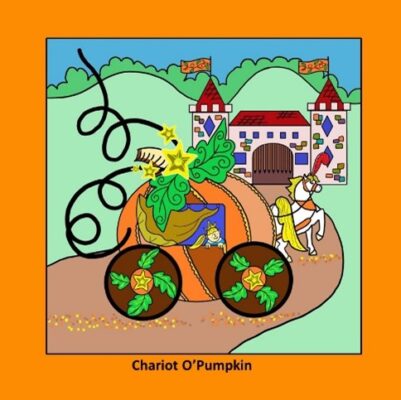
This is an example of a two-page layout from Preposterous Pumpkins (2019):

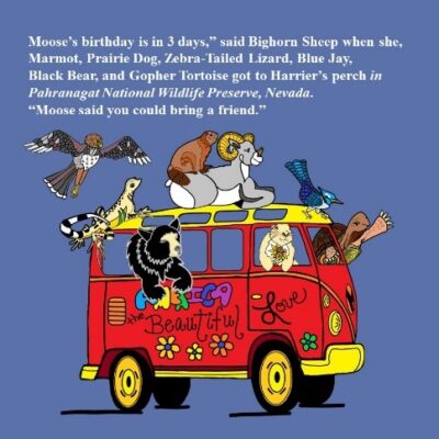
As I grew as a book designer and studied more children’s books in libraries and bookstores, I expanded my book design. This is an example of a two-page layout in Journey to Moose’s (2020):
USING A PROFESSIONAL EDITOR/TYPESETTER/DESIGNER
Earlier in this discussion, I mentioned price. So, if you really didn’t want to try to be your own editor, how much would it cost to publish a children’s book?
There are a lot of different options. First, you could try to go the traditional route and get ‘found’ by a publishing house or an agent. This path shouldn’t cost you anything. The upside- Traditional publishers cover the costs. The downside: The field is saturated, so it may take years to be “discovered.” Also, once you get a book deal, it still takes a couple of years to get the book published. The upside: The publishing house does all the designing and even provides illustrators.
Second, you could hire a publisher who will edit and design your book for you. Prices vary. The average price is around $3,000. Careful! It’s easy to be caught in a spiderweb of deceit where a company keeps milking a novice author. My suggestion? Read the fine print of a contract very, very carefully. The upside of hiring a publisher is that you get to use their name. That makes your book look like it’s been traditionally published.
Third, you could try a cheaper option such as Fiverr, Upwork, or Guru. These companies act as mediators between writers and designers. The websites offer the author a number of artists to choose from. The author picks an editor and negotiates a price. The author pays the company which holds the money until the editor sends a completed product to the author. Then the company pays the editor. This process affords a lot of flexibility, but generally, you get what you pay for. The downside: You still must self-publish.
MY FUTURE AS A BOOK DESIGNER
I want to keep growing as a self-editor and I want to try other design methods. I have visions of two-page spreads where the picture covers both pages with text interspersed across both pages.
Now I see writing children’s books not as a lark, but as a true passion. Ten books, and six years later, I still haven’t become rich and famous. I have yet to see a return on any financial investment. But I love the creative process from writing to publishing. I think every writer dreams of what they want their books to look like. Children’s book editors, especially self-published authors like me, are very lucky to have few constraints on their book design imaginations.
[Editor’s note: WAG would love to see articles on any and all topics of interest to writers. Please send your ideas or finished pieces to Cynthia D. Bertelsen at BlogEditor@writersalliance.org for consideration. Remember: these posts are more than just posts, for they are actual articles and can be cited in your CV/résumé in the same way you would a short story, essay, or any other writing credit you may possess.]

Penny Church-Pupke
Your enthusiasm is catching. Makes me want to learn more about design. An enjoyable and insightful read.
Karen Porter
This is a great description! I am so glad you share your knowledge with others like this. Your books truly are a work of art and you have such an awesome eye for design.